The following video highlights the features of our Slider Sprocket. Please also visit our document on how these new Sprockets (and others) can be displayed on your Sections: Display Options for Layout Sprockets.
Slider Sprocket
Settings for Selecting Content
Sprockets can be filled with content manually, where you select by hand what you want to appear. Or you can set up automated filters that create a content feed which updates as new articles and other content are published.
Type:
- Content (feed)
- Location (feed)
- Event (feed)
- Curated (hand-picked)
Based on the type selection, additional options are available.
When choosing content, Content Filters allow for further refinement to content types like articles, reviews, or roundups.
Filter by Tag will filter the content to display by that Tag, either to show content or omit content bearing that tag.
Filtering by Section/Subsection will define from which section to pull from.
The Limit to Current Section will make your Sprocket aware of which Section it is in (context sensitive) and it will automatically limit its contents based on this awareness.
Display Options
The new Sprockets allow for more fine-grained display options when creating Sprockets. You can now choose specifically which elements from your content appear in a Sprocket.
Choose to show any of these:
- Thumbnail
- Description
- Date
- Time
- Author
- Section
- Location
- "More" Link
Additionally, when you set the Sprockets to be automated, you can choose which order:
- Alphabetical
- Issued
- Modified
- Random
Layout Options
Slider Sprocket
Displays content horizontally as a grid with navigation buttons to advance left or right. Content adjusts to fill the full horizontal space of the Sprocket width. Pro users can modify the layout with CSS.
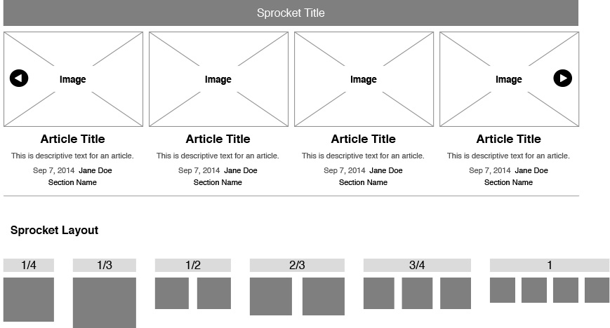
Layout Options
- Full width = 4 columns
- 3/4 width = 3 columns
- 2/3 width = 2 columns
- 1/2 width = 2 columns
- 1/3 width = 1 column
- 1/4 width = 1 column
Comments