Metro Publisher release v4.0 brings with it a responsive grid system for section layouts based on a series of new responsive Sprockets designed specifically for this use.
Settings for Selecting Content
Sprockets can be filled with content manually, where you select by hand what you want to appear. Or you can set up automated filters that create a content feed which updates as new articles and other content are published.
Type:
- Content (feed)
- Location (feed)
- Event (feed)
- Curated (hand-picked)
Based on the type selection, additional options are available.
When choosing content, Content Filters allow for further refinement to content types like articles, reviews, or roundups.
- Filter by Tag will filter the content to display by that Tag, either to show content or omit content bearing that tag.
- Filtering by Section/Subsection will define from which section to pull from.
- Limit to Current Section will make your Sprocket aware of which Section it is in (context sensitive) and it will automatically limit its contents based on this awareness.
Offset is used to continue showing more content perhaps in a different Sprocket.
For example, let's say at the top of the page you're showing the 3 most recent stories under a certain tag in a Carousel Sprocket. Then to the right, you want to show the next 5 stories with the same tag but in a Layout List. You'd put a value of 3 in the "Offset" field of that Layout List Sprocket to prevent the first 3 stories (which are already displaying in the Carousel Sprocket) from repeating on the layout list.
Interval is used to weave two lists of content together.
For example, if you had a Layout List Sprocket featuring 10 stories total but you want every other story to be sponsored, you'd set the additional content to only contain stories with the sponsored tag and you'd set an interval of 1, offset of 0.
Display Options
The new Sprockets allow for more fine-grained display options when creating Sprockets. You can now choose specifically which elements from your content appear in a Sprocket.
For example:
- Thumbnail
- Description
- Date
- Time
- Author
- Section
- Location
- Event Tags
- Show more Link (Posterboard Sprocket)
Additionally, when you set the Sprockets to be automated, you can choose which order:
- Alphabetical
- Issued
- (Last) Modified
- Random
Layout Options
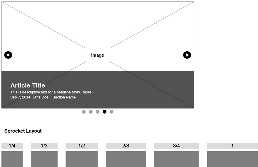
Carousel Sprocket
The Carousel Sprocket renders as a full-width image to replace the Headline Stories from the old Section edit pages. Content adjusts to fill the full horizontal space of the Sprocket width. Pro users can modify the layout with CSS.
Layout Options
- Full width at all column widths
Layout List Sprocket
This is the updated List Sprocket. Content adjusts to fill the full horizontal space of the Sprocket width. This has not changed much from the original list. Pro users can modify the layout with CSS.

Layout Options
- Full width at all column widths
Gallery Sprocket
Content in a Gallery Sprocket is arranged vertically into columns. Content also aligns horizontally to create a tighter grid than is found with the Posterboard Sprocket layout. The number of columns varies by the width of the Sprocket. Pro users can modify the layout with CSS.
Layout Options
- Full width = 3 columns
- 3/4 width = 3 columns
- 2/3 width = 2 columns
- 1/2 width = 2 columns
- 1/3 width = 1 column
- 1/4 width = 1 column
HTML (& Widgets) Sprocket
HTML Sprockets have not changed compared to previous releases. They are manually coded and can be displayed at varied widths. How well their content adjusts to those widths will depend on the specific code added.
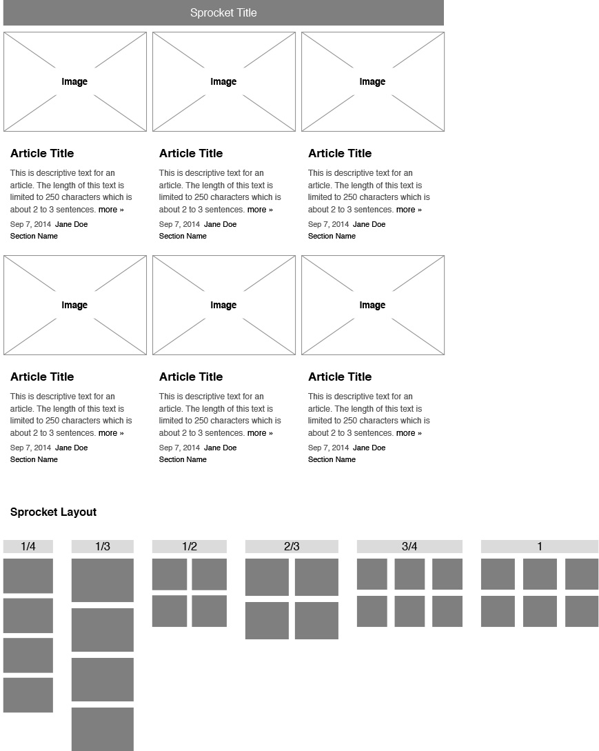
Posterboard Sprocket
Content is arranged vertically into columns. The number of columns varies by the width of the Sprocket. Pro users can modify the layout with CSS.

Layout Options
- Full width = 4 columns
- 3/4 width = 3 columns
- 2/3 width = 2 columns
- 1/2 width = 2 columns
- 1/3 width = 1 column
- 1/4 width = 1 column
Slider Sprocket
Slider Sprockets display content horizontally as a grid with navigation buttons to advance left or right. Content adjusts to fill the full horizontal space of the Sprocket width. Pro users can modify the layout with CSS.
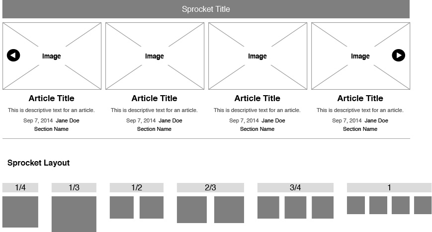
Layout Options
- Full width = 4 columns
- 3/4 width = 3 columns
- 2/3 width = 2 columns
- 1/2 width = 2 columns
- 1/3 width = 1 column
- 1/4 width = 1 column
Ad Sprocket
With the Ad Sprocket, you can easily insert custom ad slots throughout your section pages. Read more about the GAM Ad Sprocket here...
NOTE: This sprocket ONLY works with Google's Ad Manager (GAM) or Broadstreet. Other ad platforms can be applied by embedding code and using HTML Sprockets.
Is there a tutorial for the new ad sprocket?
Here is a link to the how-to for the DFP Ad Slot sprocket:
http://support.metropublisher.com/hc/en-us/articles/211097026